Understanding how to capture your wasteful business processes is one of the most useful business improvement techniques you can learn. Why is this? Because identifying bottlenecks, modelling improvement and then fixing the problem is the core of Business Process Improvement. This article is essentially a tutorial to show you how to find your wasteful processes and display them using process mapping software.
What is Data-Driven Visualisation?
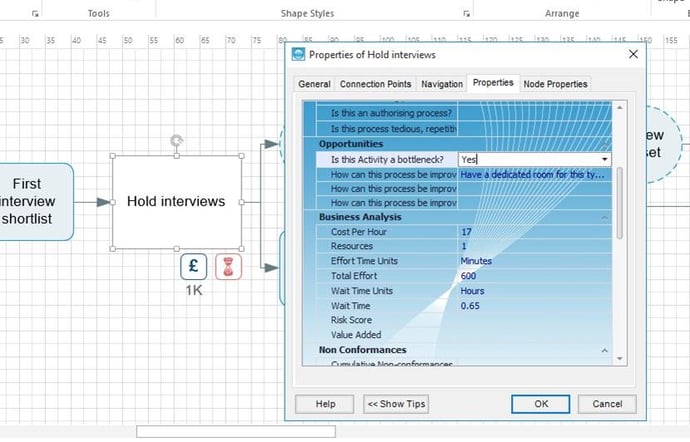
Data-driven visualisation is when an object in a process map alters its appearance based on a property of the object. For example, in the image below, have a look at the 'Hold interviews' activity, and its corresponding data fields. The question 'Is this Activity a bottleneck' has the answer 'Yes'. Notice the hour glass icon beneath the Activity?
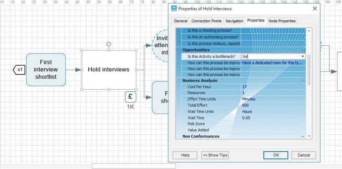
When the answer to the question becomes 'No', the icon disappears. This is a data-driven visualisation.
Triaster have implemented many such visualisations over the years. Risk is often shown as a colour coded border, but stored as a number. Warnings are shown as red triangles, but stored as a Yes\No and so on.
Learn more about the ins and outs of quantifying business process improvement by downloading our business analysis white paper.
How to Display Waste Within a Process With Data-Driven Visualisation
The major benefit of data-driven visualisation is the appearance (the presentation layer) is separated from the business rule (the data layer). Therefore, any representation of waste that fits the ‘look and feel’ of the organisation can be used. Furthermore, data can be updated as a batch process and consistently and accurately represented across all maps.
Below is an example of Data-Driven Visualisations for waste used by one Triaster customer, based on a basic value-stream approach.
For each image have a look at the data field selected and the icon showing.
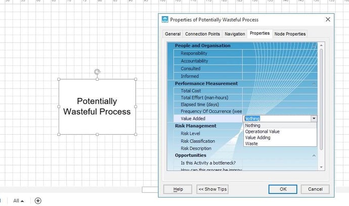
Data field selected: 'Nothing' - No icon appears.
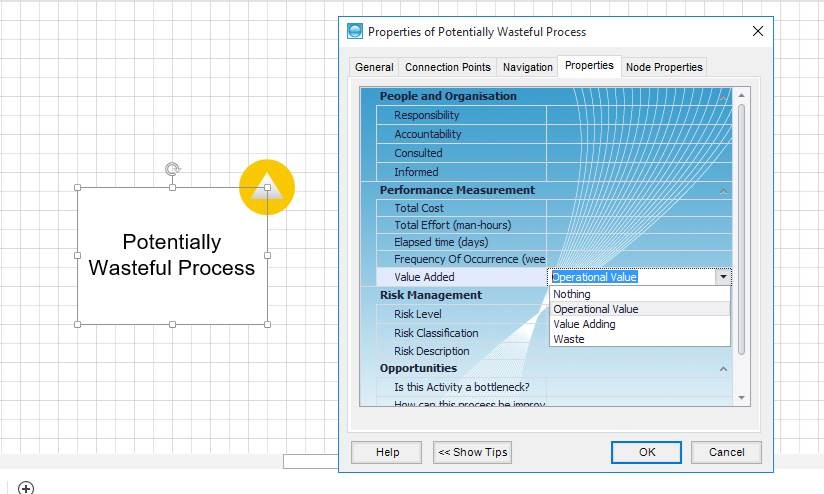
Data field selected: 'Operational Value' - Icon showing: ![]()
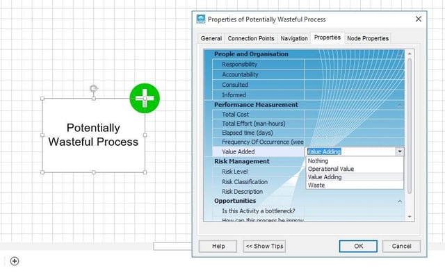
Data field selected: 'Value Adding' - Icon showing: ![]()
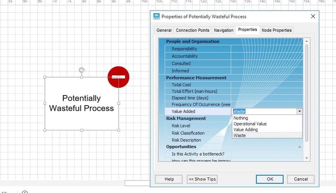
Data field selected: 'Waste' - Icon showing: ![]()
Other Examples of Business Improvement Techniques
As well as displaying Waste in this way, other business improvement techniques such as displaying Risk, Cost, Effort and so on can also be displayed as data within process mapping software through data-driven visualisation.
In the following process map, the following data-driven visualisations are being used:
- The level indicator to the top right (changes its appearance as you drill down the hierarchy)
- Icons for cost, resources and bottlenecks on each Activity
- Border colour for risk
- Text representations of end-to-end process metrics
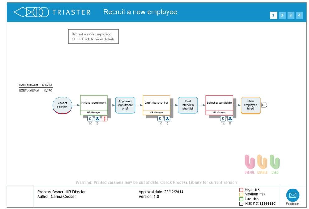
Data-driven visualisation is a very powerful technique to convey useful information in an efficient and accessible way.
Clearly, both the data-definition and the visualisation can be altered to suit specific requirements. The key thing is to let the data drive the visualisation, and not to maintain independent property values and images to describe property values as therein lies a maintenance nightmare!
If you would like more information on the business improvement techniques you can use to improve your processes then download our Business improvement e-book which looks at 8 real case studies of business improvement and the business improvement techniques they used to get there...
For information on the classification and identification of waste within a process, read this article:
Capturing waste in a process: Value-Stream and the 7 Wastes
Please also feel free to access our comprehensive continuous improvement guide which will tell you about the 4 pillars of continuous improvement.
Related Articles:
What are the 7 Wastes That are Killing Business Efficiency?
What is Lean Six Sigma? Tools for Process Improvement
Written by Michael Cousins
Mike founded Triaster in 1994. A thought leader in business improvement, he has led Triaster ever since, spearheading its development of beautifully engineered business improvement software, that is both full of the functionality required by business analysts and that end users find really easy to use.

